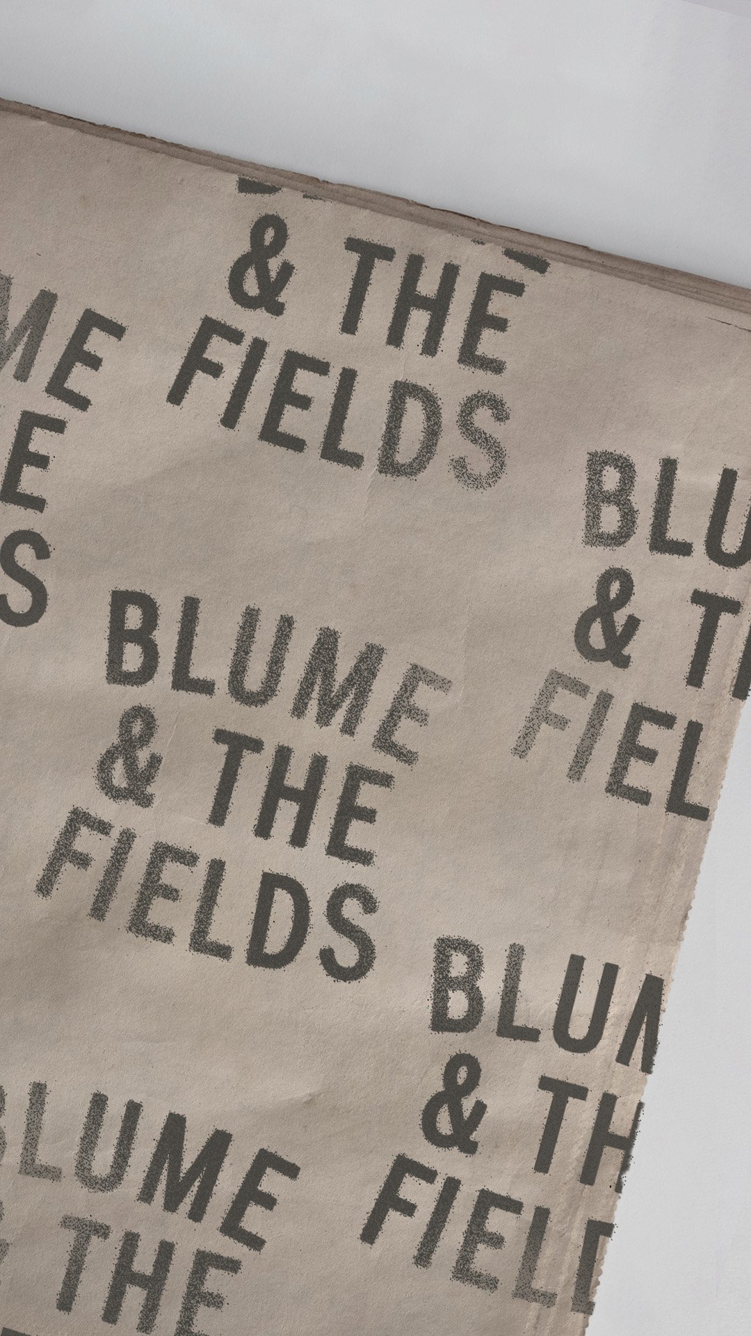
Blume & the Fields
Scope: Branding, Collateral
Key Characteristics: Organic, Luxury, Nancy Meyers inspired
After picking my jaw off the floor at the opportunity to brand for a flower farm I got to meet with the owner Camilla to chat about what she’s dreaming for the future of her farm! With a goal to sell to local florists and eventually have branded merchandise and sell seeds, we set out to highlight the flower farm’s offerings through organic, timeless, and feminine design.


I started by sketching out loads of different layouts for logos as well as a few illustrations. The first key illustration of the woman didn’t feel quite right so I went back to the drawing board (my iPad) to tighten things up before implementing this gal into logos. I ended up doing about 7 different women before feeling confident with the Blume woman figure and I’m so happy with the end result.
She felt and looked just right for the vintage and classy look we were going for.


“Just wanted to send another thank you for everything. You pushing me totally changed the direction of my farm and the excitement and support for it has been so encouraging for me. Thank you for challenging me to change and then knocking it out of the park. You’re the best!”


